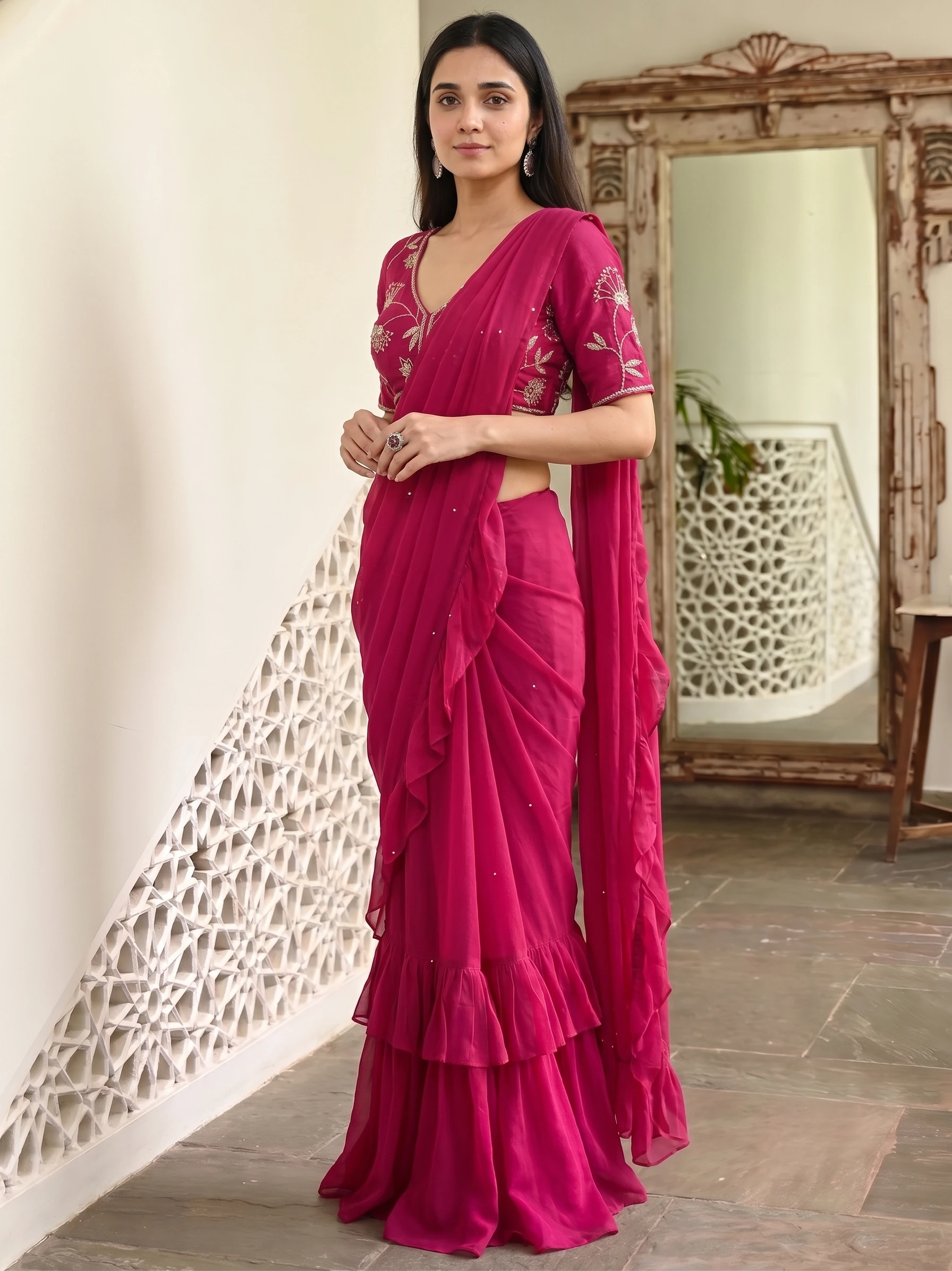
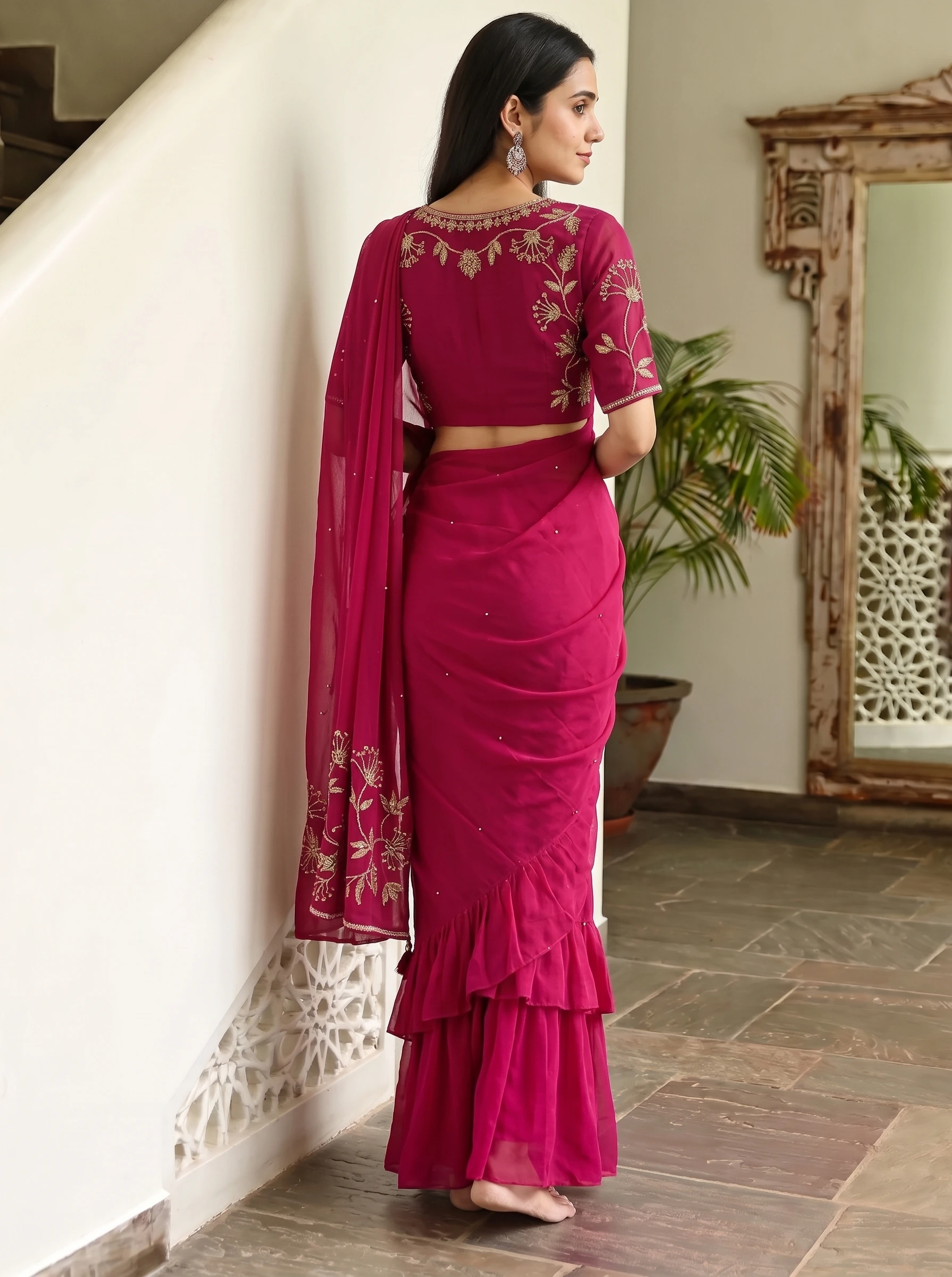
Most teams generate at one aspect ratio, then crop down for everything else and wonder why heads get cut off in the banner and the product page image feels cramped. Composition is not a post-processing step — it has to be decided before the image exists.
Pose: specify the body, not the vibe
"Confident pose" produces a different result every run. What actually controls a pose is the concrete stuff: where the weight is, what the arms are doing, where the head is turned, whether the subject is moving.
- Weight — evenly planted, or shifted onto one hip. The single biggest change to a silhouette.
- Arms — at sides, one hand in a pocket, crossed, adjusting a sleeve. Arms across the torso hide the garment; be deliberate about it.
- Head — facing camera, three-quarter, in profile, looking away. Away from camera reads editorial, at camera reads catalogue.
- Motion — standing still or mid-walk. Motion shows drape, which is why it is worth it for anything flowing.
For a category set, lock the pose family and vary it slightly rather than freely. Forty products in forty different poses is chaos; forty products in four related poses reads as a collection.
Crop: decide where the frame ends before you generate
Four crops cover almost all commerce use, and each answers a different shopper question.
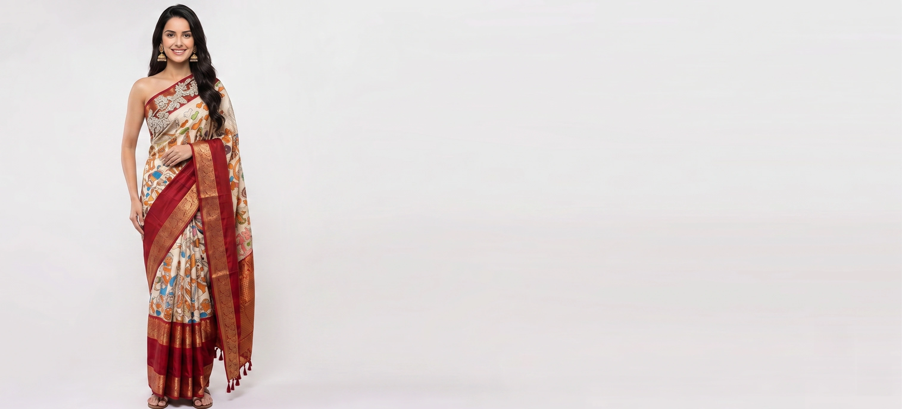
- Full length — proportion and total silhouette. Non-negotiable for dresses, sarees, outerwear, anything long.
- Three-quarter, cut mid-thigh or knee — the best all-rounder. Enough body for context, enough size for detail.
- Waist up — tops, jewellery, necklines, prints. Wasteful for anything below the waist.
- Detail crop — fabric, embroidery, hardware, stitching. Always a secondary image, never a primary.
The crop should be chosen by the question the shopper has, not by the shape of the slot you happen to be filling.
| Crop | Answers | Use for |
|---|---|---|
| Full length | Proportion and total silhouette | Dresses, sarees, outerwear — anything long |
| Three-quarter | Context plus detail | The best all-rounder |
| Waist up | Necklines, prints, jewellery | Tops and accessories |
| Detail crop | Fabric, embroidery, hardware | Always secondary, never primary |
Aspect ratio: generate for the destination
A 1:1 image cropped to 9:16 loses 44% of its width, and the subject was composed for the middle of a square. Generate at the ratio you need, or generate wider than you need with deliberate headroom.
- 1:1 — marketplace grids and category tiles. Safe, boring, universally accepted.
- 4:5 — the best ratio for a product page and for feed posts. Taller than square, so full-length garments have room.
- 9:16 — vertical video and stories. Compose with the subject high and space below, or the crop eats the shoes.
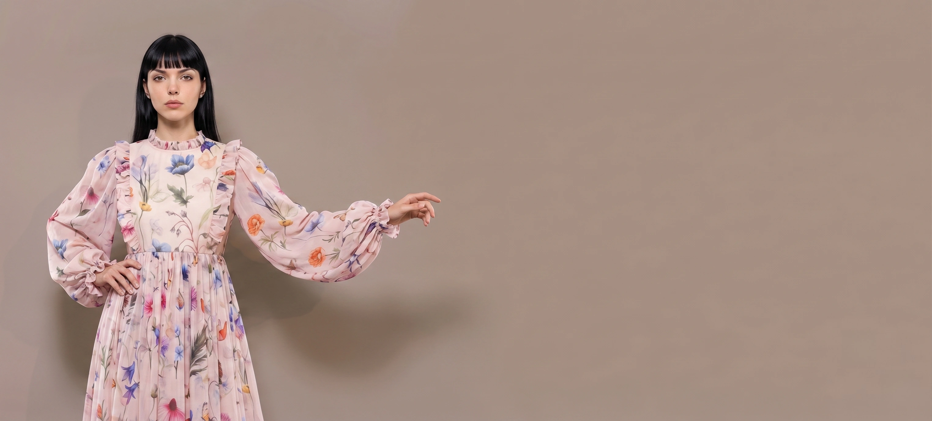
- 16:9 — homepage and email banners. The subject sits off-centre with copy space, which has to be planned, not cropped in.
| Ratio | Destination | Compose with |
|---|---|---|
| 1:1 | Marketplace grids, category tiles | Subject centred, even margin |
| 4:5 | Product pages, feed posts | Room above and below for full-length garments |
| 9:16 | Stories and vertical video | Subject high, space below — the crop eats the shoes |
| 16:9 | Homepage and email banners | Subject off-centre, planned copy space |
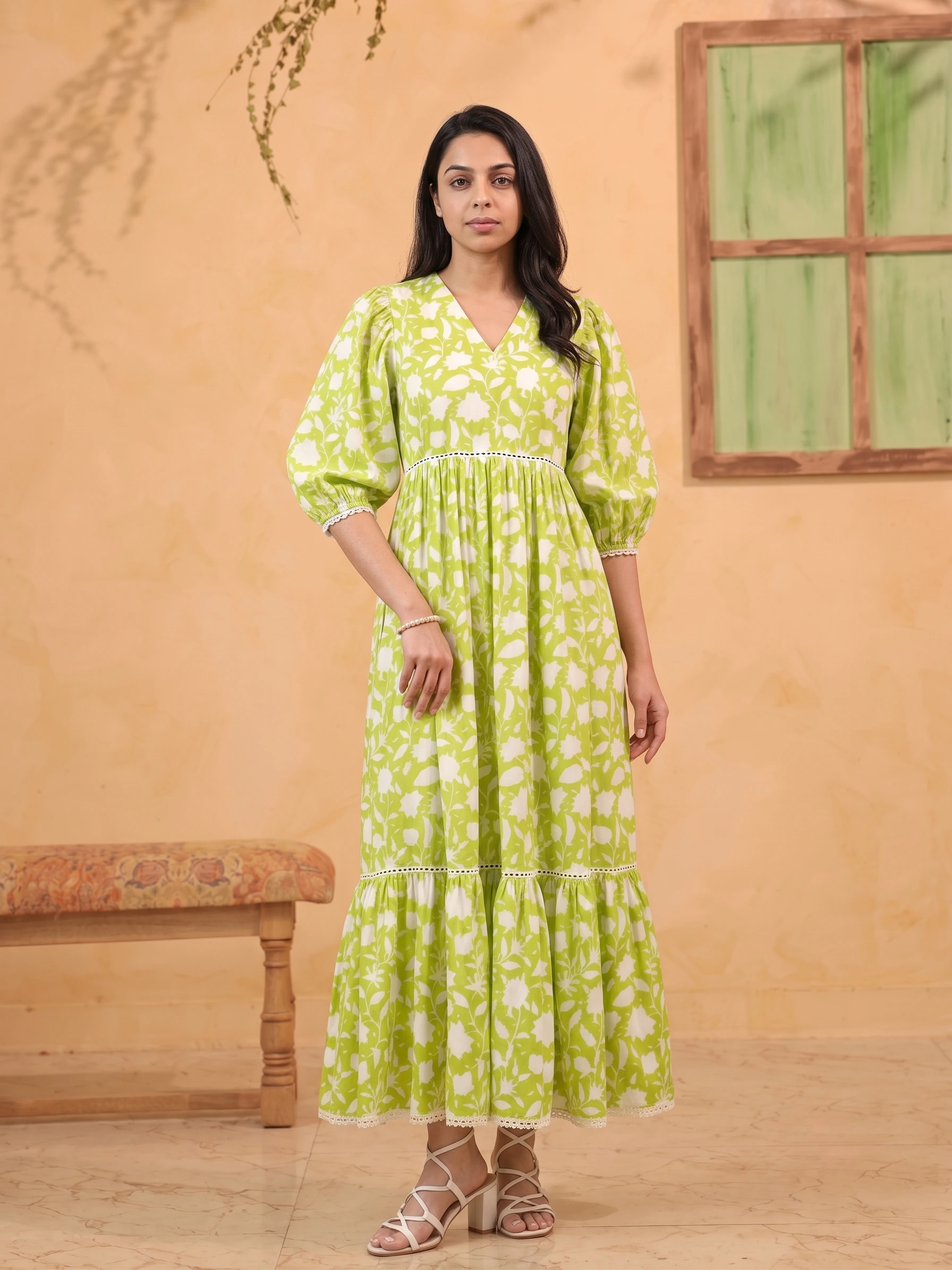
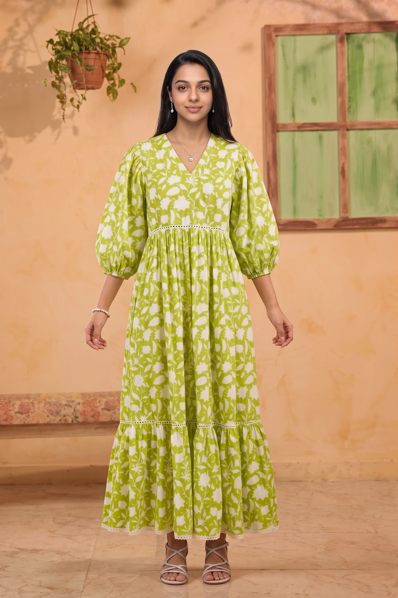
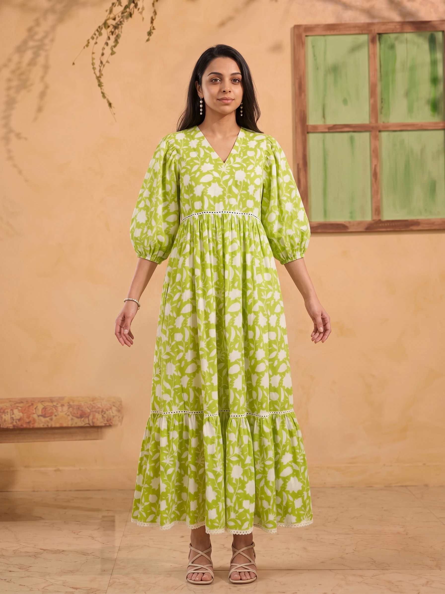
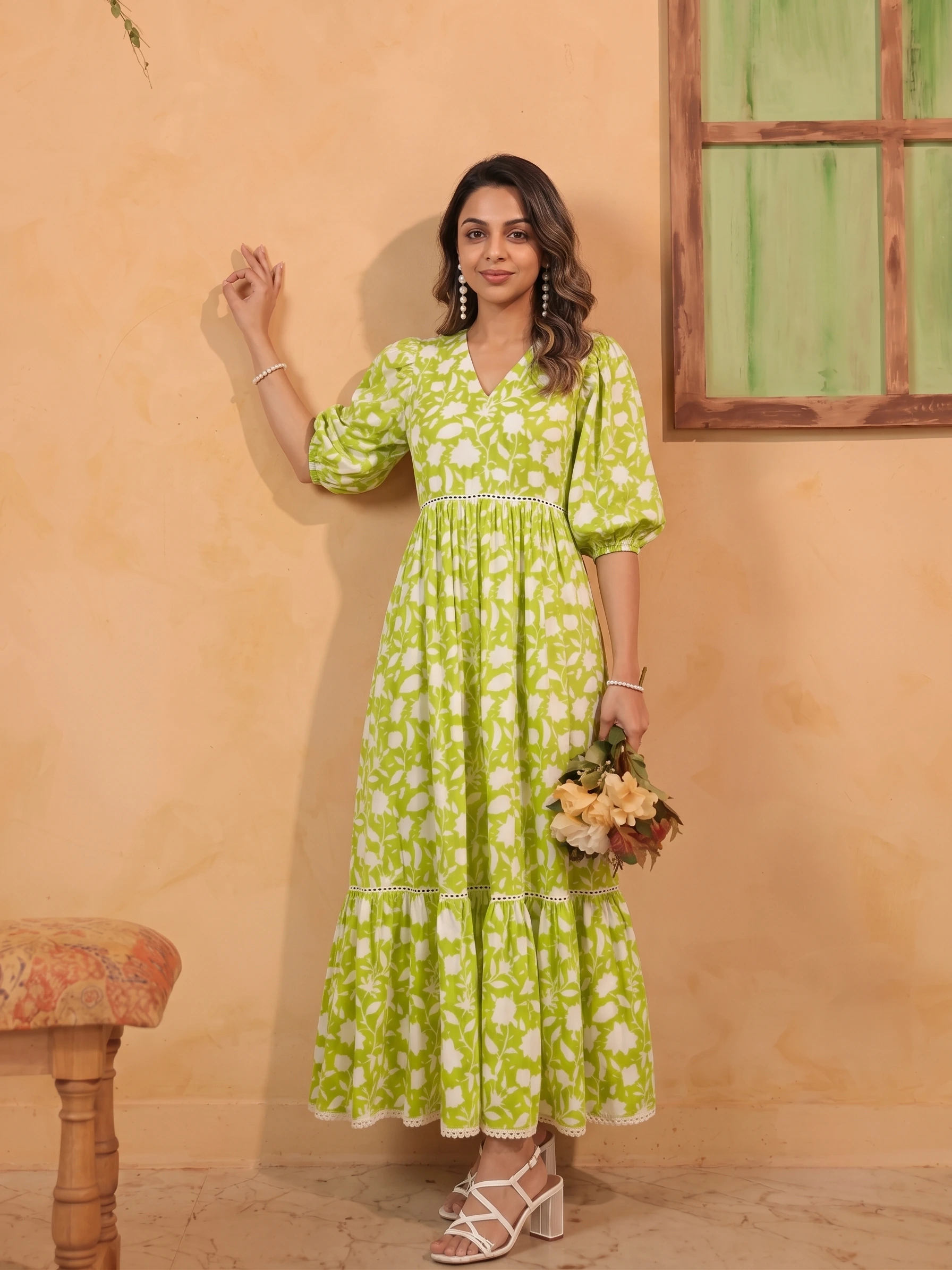
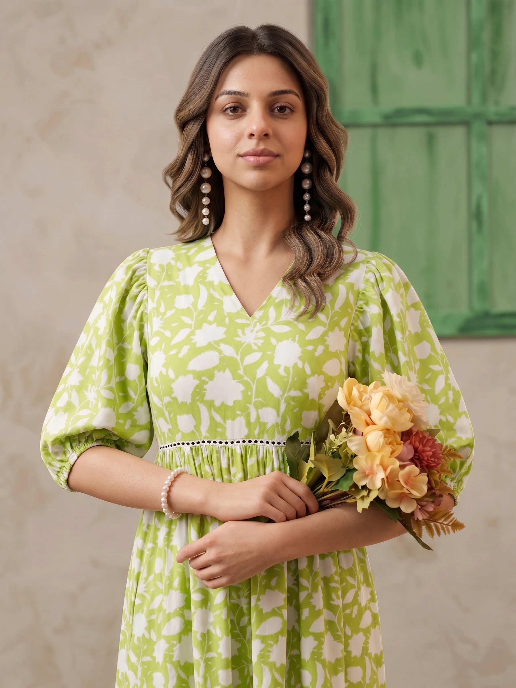
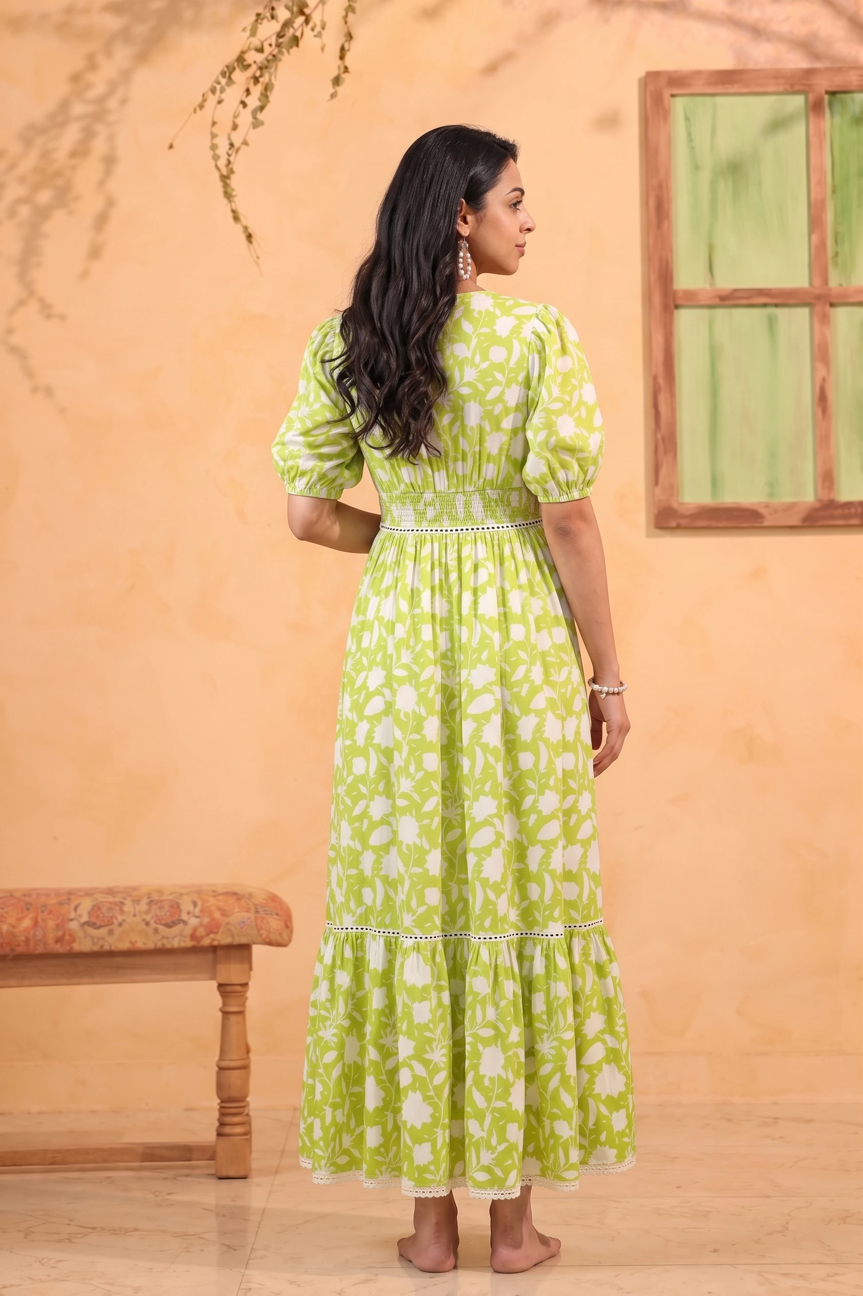
Weight, arms, head direction and where the frame ends — changed one at a time. Compose for the destination at generation time and none of these needs a re-crop later; crop a single master down instead and at least one channel gets an awkward image.
The workflow that avoids rework
Decide the destinations first and list them. Generate the primary at its native ratio at full quality. Generate the secondary ratios as their own passes rather than cropping — you keep resolution and control the composition each time. Only then export.
One more habit worth building: keep a safe margin around the subject on anything that might be re-cropped later. Frames composed edge to edge are beautiful and completely inflexible.